1 min read· by Awab Tech Lover
Data Visualization Trends Every Analyst Should Know
From Observable Plot to interactive dashboards in the browser — the chart libraries and design patterns shaping data viz in 2026.
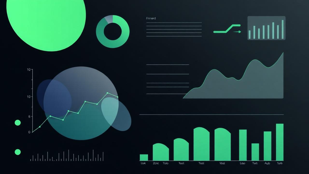
Good charts in 2026 look different from 2020 — less decoration, more context, and almost always interactive.
Libraries worth your time
- Observable Plot — grammar-of-graphics done right, tiny API
- Apache ECharts — best general-purpose interactive charts
- deck.gl — large-scale geospatial
- Plotly — still the default for scientific dashboards
Patterns that work
- Annotate the insight. Do not make readers find the spike — point at it.
- Use small multiples instead of overplotted lines.
- Direct labels beat legends on time series.
- Color is data, not decoration. Encode order with sequential scales, categories with qualitative ones.
- Mobile first — if it is unreadable at 375px, it is broken.
The accessibility floor Every chart should pass: keyboard navigation, screen-reader summary, color-blind safe palette, and a data table fallback. Not optional.